PLP Layout Size & Shape Review
Consideration of your next PLP layout's approximate size & shape is important. The features you pick will impact your enjoyment of games, for a long time. Users will have different preferences. To help with your decision, each screen scenario's impressions are described below. The goal is to pick your ideal range of size & shape. There's a good chance that some layout choices will match your preferences.

(Sniper Elite 3 2014, manual PLP)
Pick Your Layout Size
Small PLP Layouts
- Center size: 21.5" - 26"
- Total gaming pixels: 2,220,000 - 5,200,000 (weight class 1-8 / 30)
- Limited eye coverage & therefore low immersion.
- Often fairly high PPI, which allows for close viewing. This increases perceived size to mediocre.
- Not ideal, but still great fun & tend to be cheap. A decent entry point.
- No additional layout-shape notes are provided for this size. Common shape impressions do not really apply here. This is due to layouts' sub-par size; any increase method takes precedence over "ideal shape". E.g. fat sides to increase overall layout size.
Big PLP Layouts
- Center size: 27" - 34"
- Total gaming pixels: 3,732,000 - 9,101,000 (weight class 4-17 / 30)
- Thorough eye coverage (when used close) & therefore high immersion.
- Layout-shape notes are provided for this size, listing nuances that will help hone your final decision.
Very Big PLP Layouts
- Center size: 36" - 42"
- Total gaming pixels: 3,628,000-14,516,000 (weight class 4-30 / 30)
- Bigger than is needed for complete eye coverage & immersion. But impressive & offers flexible sitting distance.
- Layouts have very big size. Peripheral vision concerns are generally irrelevant. Inner bezel position also becomes of little consequence.
- No additional layout-shape notes are provided for this size. Common shape impressions only slightly apply here.
Enormous PLP Layouts
- Center size: 47" - 84"
- Total gaming pixels: 3,628,000 - 14,516,000 (weight class 4-30 / 30)
- Appropriate if sitting further back. Massive layouts, usually with big pixels.
- Layouts have enormous size. Peripheral vision concerns are generally irrelevant. Inner bezel position also becomes of little consequence.
- No additional layout-shape notes are provided for this size. Common shape impressions only slightly apply here.
Pick Your Center Screen
In PLP, the center monitor is a layout's key visual feature. It also strongly impacts layout's overall shape. Each choice has pros & cons.

16:9
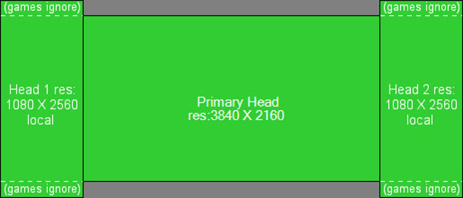
Center is perceived semi-wide & semi-short. Width prioritized, height slightly limited. This perception will remain in all layouts created with this center (unless used with slim sides). Attached sides will show less height (than if 16:10 center was used). 3D gaming view is prioritized over computing view & platformers. Inner bezels feel pushed comfortably out of central vision. Middle-ground, & biased tester's top choice.
16:10
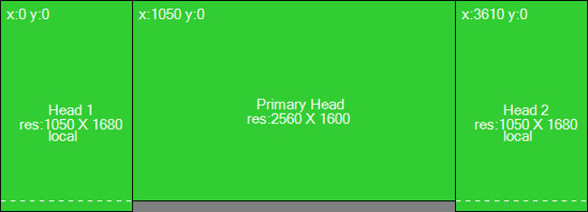
Center is perceived semi-tall & semi-slim. Height prioritized, width slightly limited. This perception will remain in all layouts created with this center (unless used with fat sides). Attached sides will show more height (than if 16:9 center was used). Computing & platformers view is prioritized over 3D gaming view. Inner bezels may feel encroaching, being pushed weakly out of central vision.
~21:9 UltraWide
Center is perceived extremely wide & extremely short. Width extremely prioritized, height an afterthought. This perception will remain in all layouts created with this center; vertical peripheral vision will not be covered. Attached sides will show less height (than if 16:9 center was used). But LLL crowd & others may find center very appealing. Its layout views are nearly LLL aspect. Will feel very height-limited in 3D gaming view & substandard for platformers & computing view (latter negated if screen-segmenting software). Inner bezels feel pushed far out of central vision.
Sides For Big 16:9 Center
Impressions relevant primarily for 27"-34" centers.
Medium Sides

- Sides have medium perceived width. Large enough for game immersion & computing. 5/10 (medium) extra weight on resources. Middle-ground, & biased tester's top choice.
- Overall layout shape: Center screen is emphasized well. Peripheral vision is covered on sides, with no overkill side width. Overall layout may feel hint short & wide.
Slim Sides

- Sides have slim perceived width. Still very good, just large enough for game immersion & computing. 4/10 (medium-low) extra weight on resources.
- Overall layout shape: Center screen is emphasized a bit strongly. Peripheral vision remains basically covered on sides, while height is very slightly emphasized.
Semi-Fat Sides

- Sides have semi-fat perceived width. Ample for game immersion & computing. 6/10 (medium-high) extra weight on resources.
- Overall layout shape: Center screen is emphasized a bit weakly. Peripheral vision is covered amply on sides, with slight overkill side width. Overall layout may feel somewhat short & wide.
Fat Sides

- Sides have fat perceived width. Overkill for game immersion & computing. 7/10 (high-ish) extra weight on resources.
- Overall layout shape: Center screen is emphasized weakly. Peripheral vision is covered in abundance on sides, with overkill side width. Overall layout may feel significantly short & wide.
Skinny Sides

- Sides have skinny perceived width. Likely unsatisfying. Not large enough for proper game immersion & cramped for computing. 3/10 (low-ish) extra weight on resources.
- Overall layout shape: Center screen is emphasized very strongly. Peripheral vision is poorly covered on sides, while height is emphasized.
Sides For Big 16:10 Center
Impressions relevant primarily for 27"-34" centers.
Medium Sides

- Sides are tall & medium perceived width. Large enough for game immersion & computing. 6/10 (medium-high) extra weight on resources.
- Overall layout shape: Center screen is emphasized well. Peripheral vision is basically covered on sides, while height is slightly emphasized. Overall layout may feel tall & slim.
Semi-Fat Sides

- Sides are tall & semi-fat perceived width. Ample for game immersion & computing. 7/10 (high-ish) extra weight on resources.
- Overall layout shape: Center screen is emphasized a bit weakly. Peripheral vision is covered on sides, with no overkill side width. Overall layout may feel a hint tall & slim.
Fat Sides

- Sides are tall & fat perceived width. Overkill for game immersion & computing. 8/10 (high) extra weight on resources.
- Overall layout shape: Center screen is emphasized weakly. Peripheral vision is covered amply on sides, with slight overkill side width. But side width compensates well for the slim center.
Sides For Big ~21.9 UltraWide Center
Impressions relevant primarily for 27"-34" centers.
Semi-Fat Sides

- Sides are short & semi-fat perceived width. Ample for game immersion & computing. 5/10 (medium) extra weight on resources.
- Overall layout shape: Center screen is emphasized fairly strongly. Peripheral vision is covered amply horizontally, but vertical vision lost & sides will feel somewhat far away. Overall layout feels quite short & wide.
Fat Sides

- Sides are short & fat perceived width. Overkill for game immersion & computing. 6/10 (medium-high) extra weight on resources.
- Overall layout shape: Center screen is emphasized strongly. Peripheral vision is covered in abundance horizontally, but vertical vision lost & sides will feel slightly far away. Overall layout feels very short & wide.
Medium Sides

- Sides are short & medium perceived width. Looks good, just large enough for game immersion & computing. 3/10 (low-ish) extra weight on resources.
- Overall layout shape: Center screen is emphasized very strongly. Peripheral vision is covered horizontally, but vertical vision lost & sides will feel far away. Overall layout feels short & wide.
Skinny Sides

- Sides are short & skinny perceived width. Somewhat unsatisfying. Not quite large enough for ideal game immersion & bit cramped for computing. 2/10 (low) extra weight on resources.
- Overall layout shape: Center screen is emphasized extremely strongly. Peripheral vision is covered on sides through 21:9 center's compensating width. But vertical vision lost & sides will feel quite small & far away. Overall layout may feel awkward, short & wide.
More Help
Source PLP wiki, unabridged layouts list & how-to
http://plp-gaming.wikia.com/wiki/Good_PLP_Monitor_Setups
| Attachment | Size |
|---|---|
| Sniper Elite 3 2014.jpg | 915.42 KB |
| Screen Ratio Difference.jpg | 28.24 KB |
| Shape260 2560x1440 1680x1050 PLP.jpg | 39.49 KB |
| Shape230 2560x1440 1440x900 PLP.jpg | 32.06 KB |
| Shape280 2560x1440 1920x1200 PLP.jpg | 44.61 KB |
| Shape030 1920x1080 1280x1024 PLP.jpg | 38.51 KB |
| Shape340 3840x2160 2560x1080 PLP.jpg | 44.13 KB |
| Shape300 2560x1600 1680x1050 PLP.jpg | 37.51 KB |
| Shape290 2560x1600 1600x1200 PLP.jpg | 31.49 KB |
| Shape150 1920x1200 1280x1024 PLP.jpg | 34.77 KB |
| Shape200 2560x1080 1280x1024 PLP.jpg | 34.1 KB |
| Shape320 3440x1440 2560x1080 PLP.jpg | 48.59 KB |
| Shape207 2560x1080 1600x1200 PLP.jpg | 38.88 KB |
| Shape205 2560x1080 1440x900 PLP.jpg | 38 KB |
